
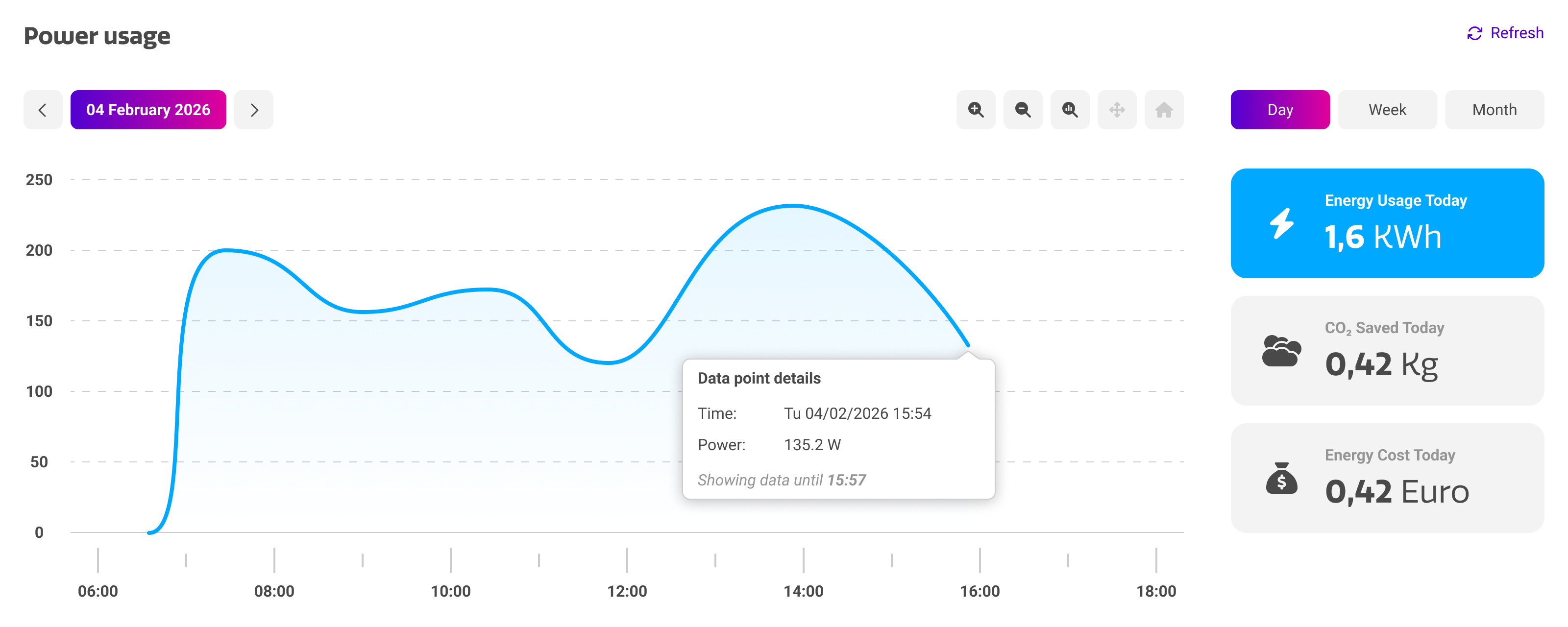
The power usage section of the device details page shows how much power your device draws over time. It combines a detailed graph with a summary of energy consumption, CO2 savings and cost savings, allowing you to assess the energy behavior of an individual display and to identify devices that consume more than expected.
Graph Types
The default graph plots the measured power draw of your device, expressed in watts, against time. Each measurement is a data point on the line, and the area underneath is filled so that periods of high and low consumption are easy to distinguish at a glance. You can press the blocks on the right to switch graph and data types:
|
Card |
Purpose |
|---|---|
|
Energy usage |
The total energy consumed by the device over the selected period, expressed in kWh. |
|
CO2 saved |
The amount of CO2 avoided over the selected period, expressed in kilograms. |
|
Energy cost |
The cost of the energy consumed over the selected period. You can change your KWh cost and currency in your account settings. |
By hovering over the graph, a ‘data point details’ tooltip appears for the nearest measurement. It shows the exact date and time of the measurement and the power draw at that moment, along with a note indicating up to which point measurements are available.
Measurements are only reported while a device is online. When a device has been switched off or disconnected, the graph shows no data for that period.
Selecting a time period
Above the graph, you can use the controls to further specify the period in which you want to view the power usage.
|
Control |
Purpose |
|---|---|
|
Day / Week / Month |
Sets the length of the period shown in the graph. The day view plots the individual measurements of a single day, while the week and month views aggregate consumption over a longer span. |
|
Date |
Shows the period that is currently displayed. You can use the arrows to jump to next or previous periods, or press the date itself to pick a specific date on a calendar. |
|
Refresh |
Reloads the graph to include the most recent measurements reported by the device. |
Navigating the graph
The toolbar on the right-hand side of the period selector lets you inspect the graph in more detail. This is particularly useful in the week and month views, where a short peak in consumption can otherwise be difficult to read.
|
Control |
Purpose |
|---|---|
|
Zoom in |
Narrows the visible time span around the centre of the graph. |
|
Zoom out |
Widens the visible time span. |
|
Zoom to selection |
Lets you draw a rectangle over the graph to zoom in on a specific interval. |
|
Pan |
Moves the visible section of the graph left or right while keeping the current zoom level. |
|
Home |
Returns the graph to its default view for the selected period. |
Reducing power consumption
The power usage section is most valuable when you use it to act on what you find. Displays that consume energy outside teaching or office hours are usually the quickest win.
-
Use a power schedule to switch devices off automatically outside working hours.
-
Review the power-on behaviour of a device to prevent it from waking unnecessarily.